PTE Academic · speaking · 12 real bank items

PTE Describe Image practice: 12 images with answers

Twelve real Describe Image pictures from the EdKnot bank, each with a model description you can say in 40 seconds. You get 25 seconds to study the image and 40 to speak; the task is scored for Content, Oral fluency and Pronunciation.

12 Describe Image practice images with answers

Real items from the EdKnot bank, in random order. Each one opens in the practice player with the timer, the recording and AI scoring. Format, scoring and technique are on the Describe Image task page.

  1. Population Density Map

    31 words
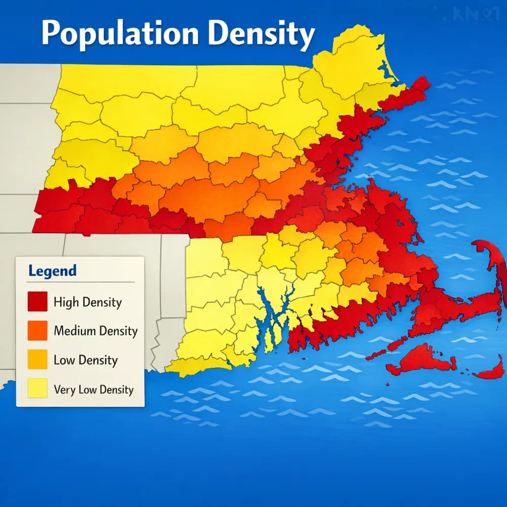
    Population Density Map

    Look at the graph below. In 25 seconds, please speak into the microphone and describe in detail what the graph is showing. You will have 40 seconds to give your response.

    Model description · 72 words

    This map shows population density levels across a country using a colour-coded legend. Coastal regions appear dark red, marking the highest density. Central areas are shown in orange for medium density, while the north is yellow for low density. The south, in light yellow, records the very lowest density of all. Taken together, the map reveals population concentrated heavily along the coastline and thinning out toward the country's interior and southern edges.
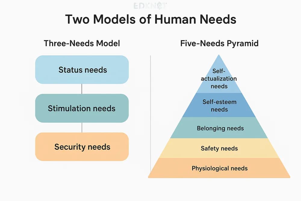
  2. Needs Models Comparison

    31 words
    Needs Models Comparison

    Look at the graph below. In 25 seconds, please speak into the microphone and describe in detail what the graph is showing. You will have 40 seconds to give your response.

    Model description · 75 words

    This diagram compares two models of human needs. The left-hand model divides needs into three categories: status needs, stimulation needs, and security needs. The right-hand model, arranged from top to bottom, lists five levels: self-actualization, self-esteem, belonging, safety, and physiological needs. Safety needs are defined as freedom from fear, while belonging needs refer to friends, family, and love. Despite different structures, both models ultimately represent the same idea: the different kinds of needs humans have.

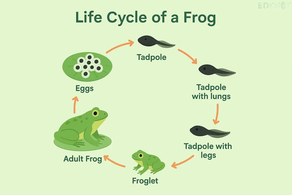
  3. Frog Life Cycle — II

    31 words
    Frog Life Cycle — II

    Look at the graph below. In 25 seconds, please speak into the microphone and describe in detail what the graph is showing. You will have 40 seconds to give your response.

    Model description · 57 words

    This diagram traces the life cycle of a frog through seven stages. It begins with eggs, which hatch into tadpoles. The tadpole then develops lungs, followed by legs, before becoming a froglet. The froglet matures into a young frog and finally an adult frog. Once mature, the adult frog lays new eggs, and the entire cycle repeats.

  4. Public Transport Usage by City 2023

    31 words
    Public Transport Usage by City 2023

    Look at the graph below. In 25 seconds, please speak into the microphone and describe in detail what the graph is showing. You will have 40 seconds to give your response.

    Model description · 65 words

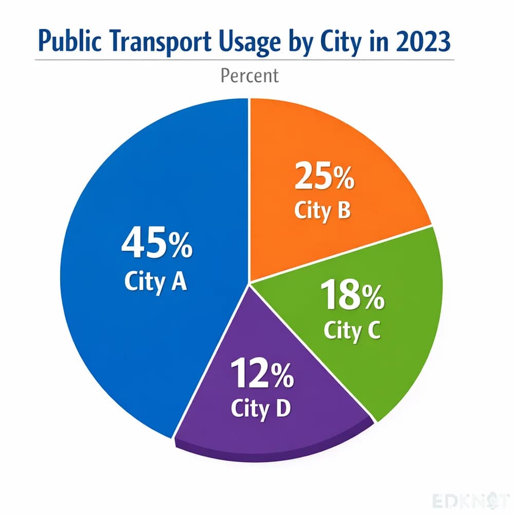
    This pie chart shows public transport usage across four cities in 2023. City A leads with the highest share at 45 percent, while City B follows at 25 percent. City C accounts for 18 percent, and City D has the smallest share at just 12 percent. Overall, the chart indicates that City A depends on public transport far more heavily than the other three cities.

  5. City Temperature Comparison

    31 words
    City Temperature Comparison

    Look at the graph below. In 25 seconds, please speak into the microphone and describe in detail what the graph is showing. You will have 40 seconds to give your response.

    Model description · 82 words

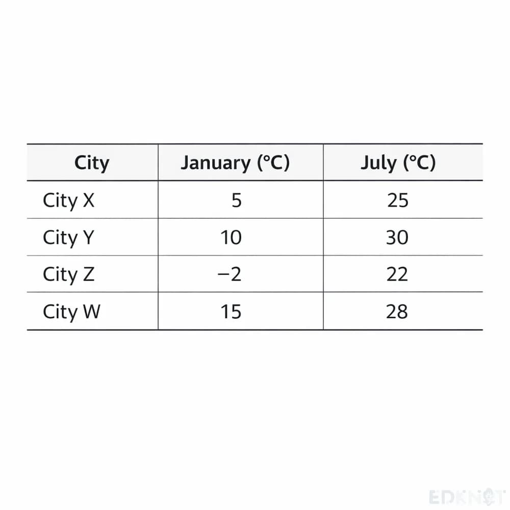
    This table compares average temperatures in January and July across four cities. City X records five degrees in January and twenty-five in July. City Y shows ten degrees in January, rising to thirty in July, the highest July figure. City Z has the coldest January reading at minus two degrees, reaching twenty-two in July. City W records fifteen degrees in January and twenty-eight in July. Overall, the table highlights a clear seasonal rise in temperature for every city from winter to summer.

  6. Internet Connection Process

    31 words
    Internet Connection Process

    Look at the graph below. In 25 seconds, please speak into the microphone and describe in detail what the graph is showing. You will have 40 seconds to give your response.

    Model description · 79 words

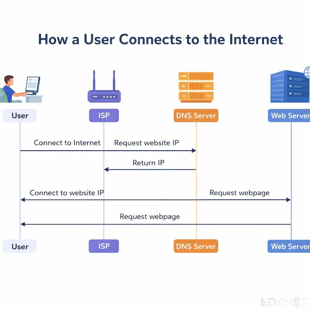
    This diagram explains the process of connecting to the internet, involving an ISP, a DNS server and a web server. The process starts when a user connects to a website's IP address, then sends a request for the webpage in order to reach the web server. The DNS server plays its part by returning the IP address back to the ISP. Overall, the diagram maps out the sequence of steps that link a user's request to a web server.

  7. Christmas Celebration Scene

    31 words
    Christmas Celebration Scene

    Look at the graph below. In 25 seconds, please speak into the microphone and describe in detail what the graph is showing. You will have 40 seconds to give your response.

    Model description · 65 words

    This image depicts a festive Christmas scene centered on Santa Claus. He is shown driving an elk while carrying an armful of gifts. Beside him stands a Christmas tree decked out with numerous decorations. A red banner in the scene reads 'Merry Christmas.' Together these elements capture classic imagery associated with the Christmas holiday, from Santa delivering presents to the decorated tree marking the celebration.

  8. Temperature Precipitation Vancouver

    31 words
    Temperature Precipitation Vancouver

    Look at the graph below. In 25 seconds, please speak into the microphone and describe in detail what the graph is showing. You will have 40 seconds to give your response.

    Model description · 73 words

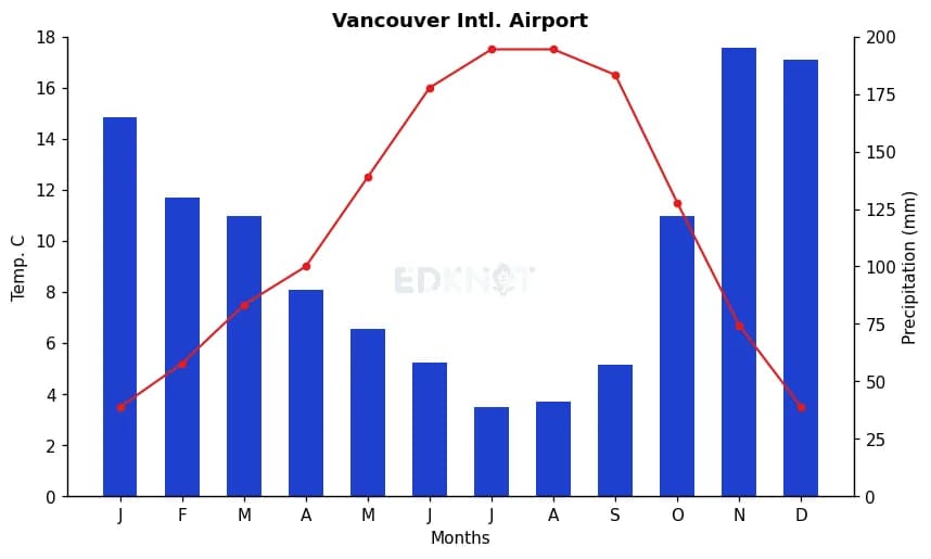
    This graph shows monthly temperature and precipitation at Vancouver International Airport. Temperature, plotted as a red line, dips to its lowest around 2 degrees Celsius in January and December, then climbs to a peak of about 17 degrees in June and July. Precipitation, shown in blue bars, peaks at roughly 190 millimeters in November and falls to its lowest, about 40 millimeters, in July. Overall, rainfall is lowest exactly when temperatures are warmest.

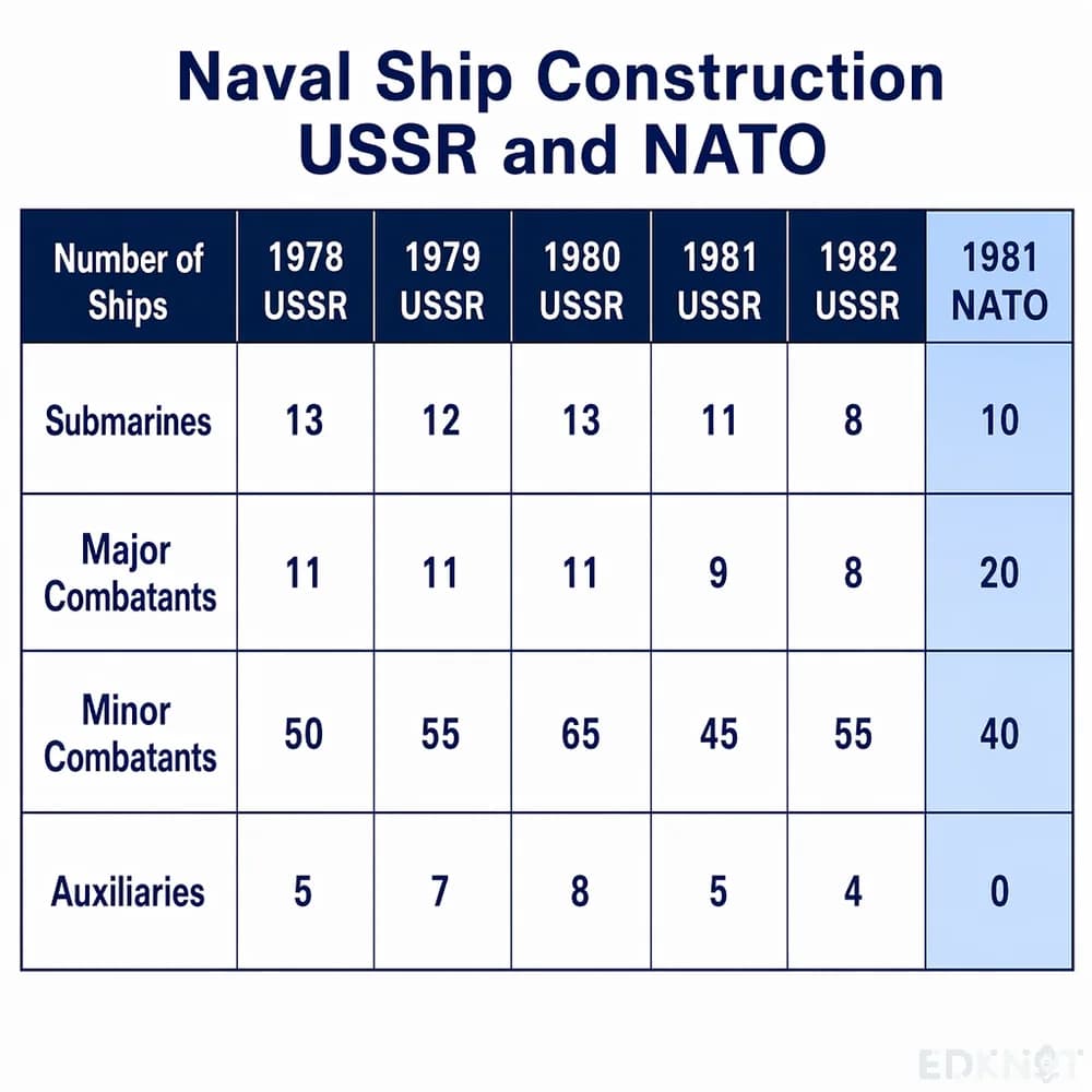
  9. Naval Ship Construction

    31 words
    Naval Ship Construction

    Look at the graph below. In 25 seconds, please speak into the microphone and describe in detail what the graph is showing. You will have 40 seconds to give your response.

    Model description · 65 words

    This chart compares naval ship construction between the USSR and NATO. Minor combatants reached the highest count, around sixty-five vessels, in 1980. Submarine numbers stood at about thirteen in 1980, falling to roughly eleven in 1981. Auxiliary vessels had the lowest count overall, at around four. Together, the figures show minor combatants far outweighing other ship categories, while submarine construction declined slightly year over year.

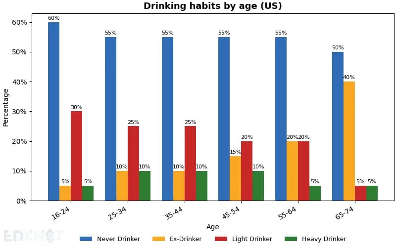
  10. Drinking Habits By Age

    31 words
    Drinking Habits By Age

    Look at the graph below. In 25 seconds, please speak into the microphone and describe in detail what the graph is showing. You will have 40 seconds to give your response.

    Model description · 76 words

    This bar chart compares drinking habits across two age groups in the US. Among sixteen to twenty four year olds, sixty percent have never drunk, the largest share, while only five percent are heavy drinkers, the smallest. Among sixty five to seventy four year olds, ex-drinkers form the largest share at forty percent, with heavy drinkers again lowest at five percent. Overall, drinking status shifts from mostly never-drinkers in youth to mostly ex-drinkers in old age.

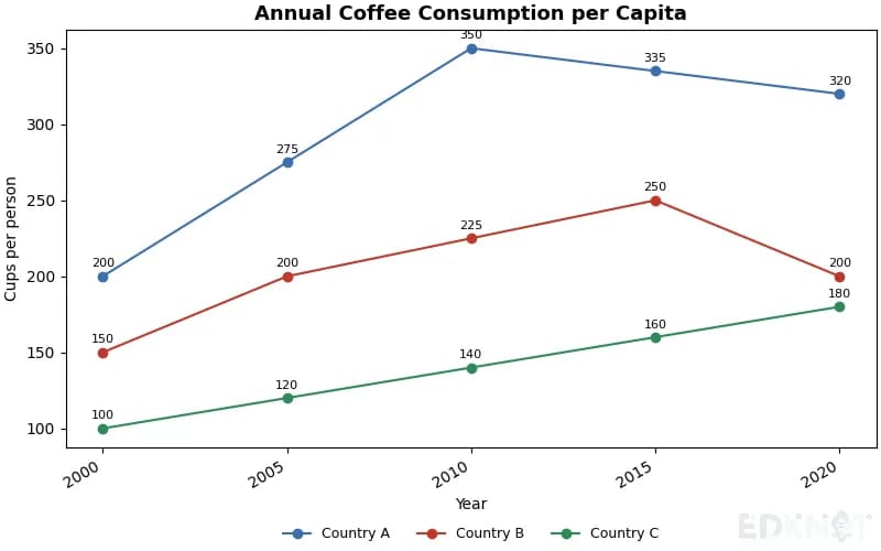
  11. Annual Coffee Consumption per Capita

    31 words
    Annual Coffee Consumption per Capita

    Look at the graph below. In 25 seconds, please speak into the microphone and describe in detail what the graph is showing. You will have 40 seconds to give your response.

    Model description · 80 words

    This line graph tracks annual coffee consumption per capita for three countries from 2000 to 2020, in cups per person per year up to 400. Country A, in blue, rises from about 200 cups to a peak near 350 in 2010, then eases to 320 by 2020. Country B, in red, climbs from 150 to 250 by 2015 before falling to 200. Country C, in green, grows slowly from 100 to 180 cups. Country A stays the highest consumer throughout.

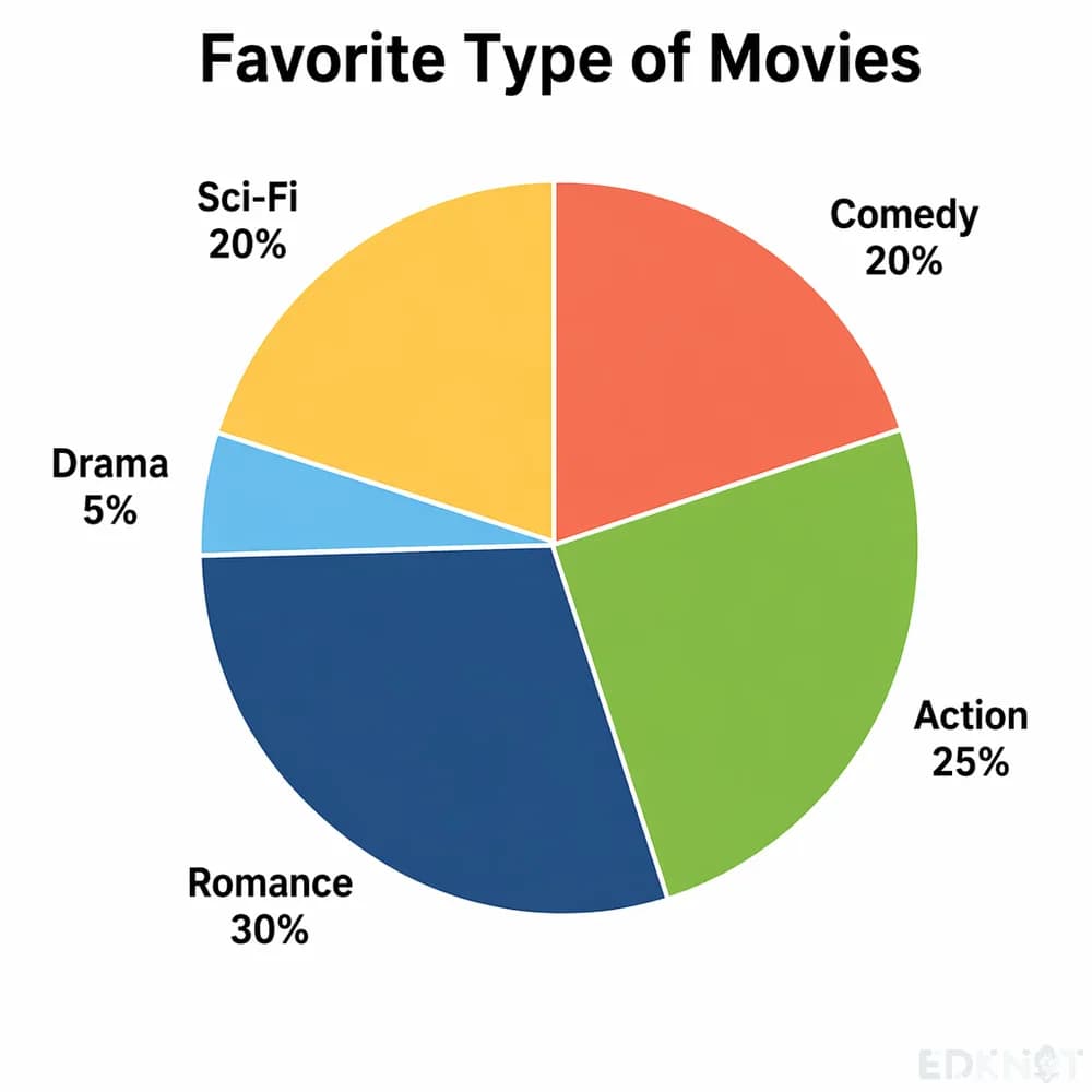
  12. Favorite Movie Genres Pie Chart

    31 words
    Favorite Movie Genres Pie Chart

    Look at the graph below. In 25 seconds, please speak into the microphone and describe in detail what the graph is showing. You will have 40 seconds to give your response.

    Model description · 63 words

    This pie chart shows the distribution of people's favorite movie genres. Romance ranks highest, preferred by 30 percent of respondents, followed by action at 25 percent. Comedy and science fiction are equally popular, each accounting for 20 percent. Drama trails far behind as the least favored genre, chosen by only 5 percent. Overall, romantic and action films clearly dominate audience preference over drama.

Frequently asked questions

What should a Describe Image answer cover?

The type of chart, the topic, two or three real values with their labels, the trend or the extreme, and one closing sentence. Content is scored on whether the main features are named, not on how much you say.

How long should I speak?

Aim for 30 to 35 seconds of the 40. The recording stops after 3 seconds of silence, so keep going until the closing sentence.

Is the model description the only correct one?

No. It shows one way to cover the main features at a steady pace. Your own order and wording score as long as the values and the trend are there.